
People were finding the site, but only 0.8% of visitors converted. The problem wasn't getting people there. It was what happened once they landed.
When the team looked at the numbers, the acquisition side was healthy. Click-through on the content driving traffic to mock interviews sat at 3–4%, so people were interested enough to arrive. But only 0.8% of them bought. That gap told us the content was doing its job and the website wasn't: visitors landed interested and left without paying.
A small cross-functional pod that reviewed the conversion number together every week.
Owned research, IA, flows, UI and handoff end to end.
I went through the existing page fold by fold, asking a simple question at each step: if I'd never heard of Intervue, what would make me leave here? Two problems accounted for almost all of it.

15 calls with students and working professionals looking to switch jobs, to understand why people buy mock interviews and what stopped them.
Ten questions in the order we asked them, with follow-ups wherever an answer needed digging into.
Most people who booked had been sent by a friend who had already taken one and liked it. Very few found the website and booked on their own.
People loved the experience. The offering worked, the website didn't.
Three patterns showed up across the calls, each stalling at a different point before booking.
Usually has an interview lined up in the coming weeks. Reads reviews and checks who the interviewers are before committing. Needs proof up front, or they leave to keep researching elsewhere.
Intent is already high and they get as far as the form. What stops them is paying before knowing what happens next. Needs a clear picture of the session and who runs it.
Has several tabs open with other mock interview options. Judges value per session and moves on if the price feels arbitrary. Needs pricing that clearly shows what they get for it.
Each insight mapped to a design decision.
Trust showed up too late
→Proof in the first fold
Paying felt like a blind leap
→Show what happens after payment
Interviewers felt anonymous
→Profiles with company & ratings
One session isn't how people prep
→Bundles as the default offer
Users prepare across several rounds, not one. A bundle matches that, raises order value, and gives every company search a page to land on.
People don't prepare with one interview. They prepare with a plan, so selling a single session was selling the wrong unit.
The Core Insight
The redesign pulled credibility into the first fold, gave high-intent searches their own bundle pages, and turned booking into a clear, guided flow. Each screen with its page-wise traffic and conversion.
Interviewer credentials, company logos, reviews and outcomes moved from the third fold to the first, so the question “is this legitimate?” is answered before a visitor has a chance to bounce.


Each company and role search lands on its own bundle page: what the rounds cover, who runs them, and what the plan costs per session, all before the booking starts.
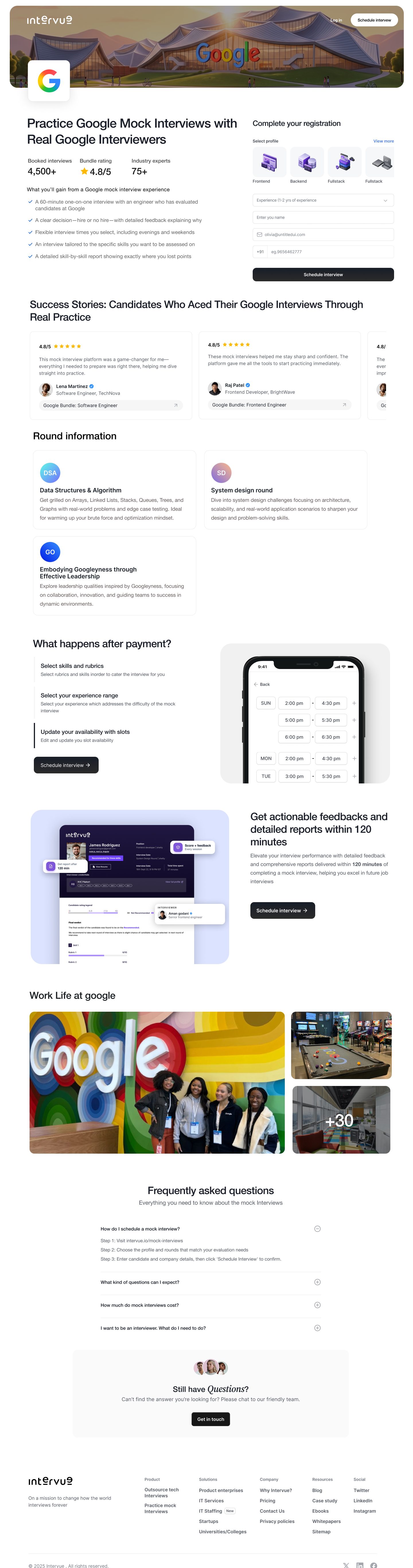

The flow walks users through every choice in order: pick an interviewer from profiles showing company, experience and ratings, share their details, then choose the number of bundles and rounds.
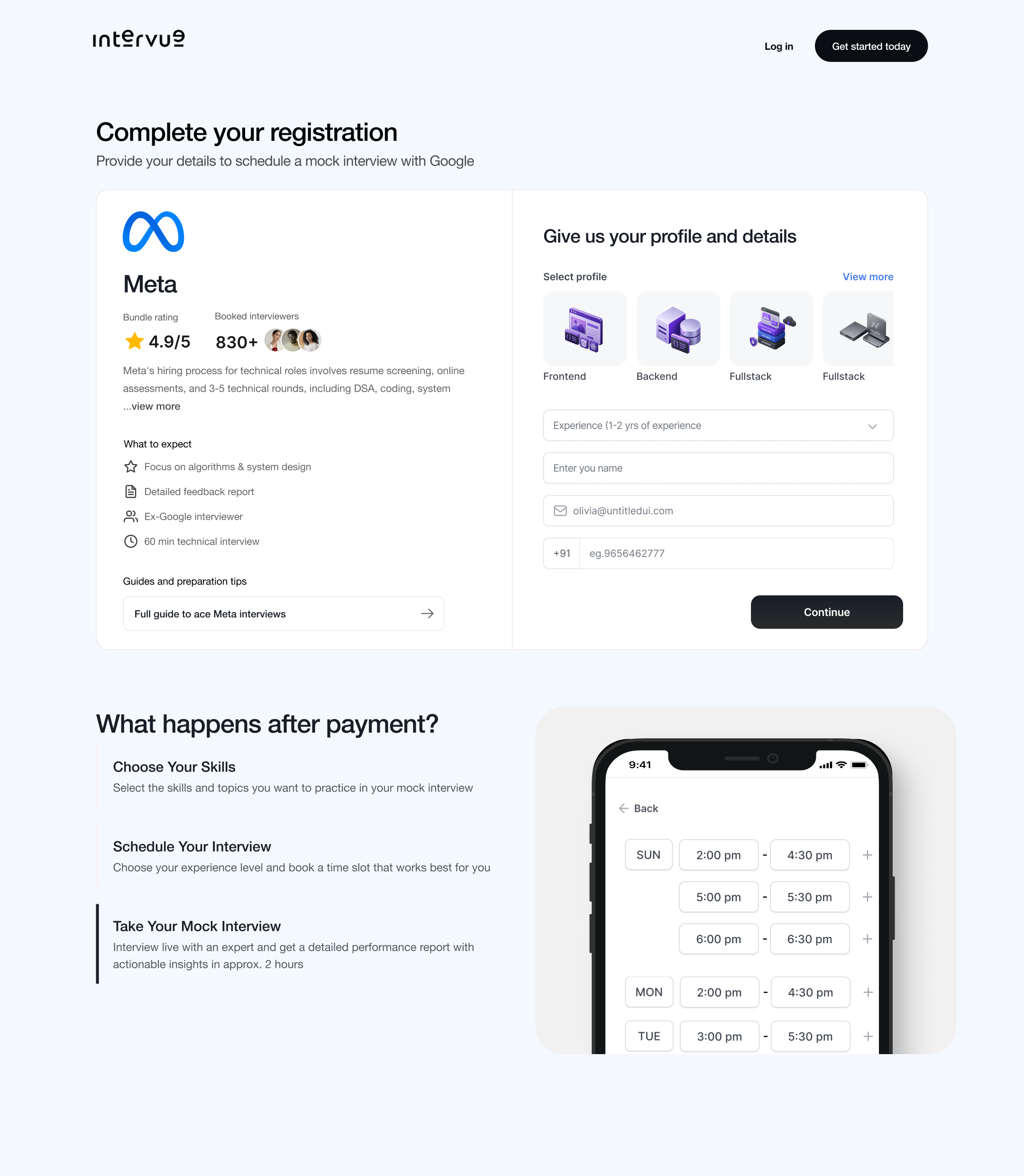
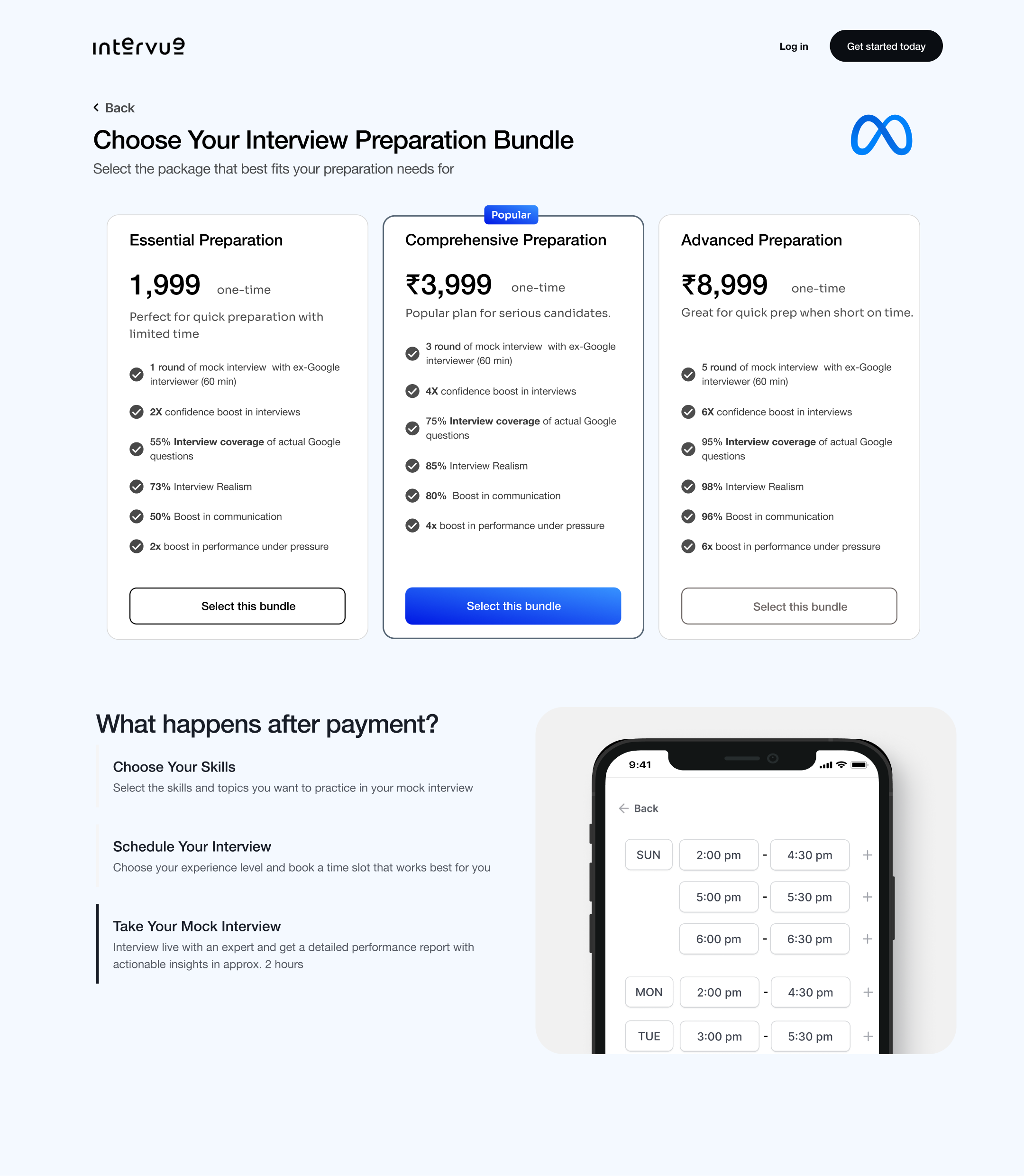
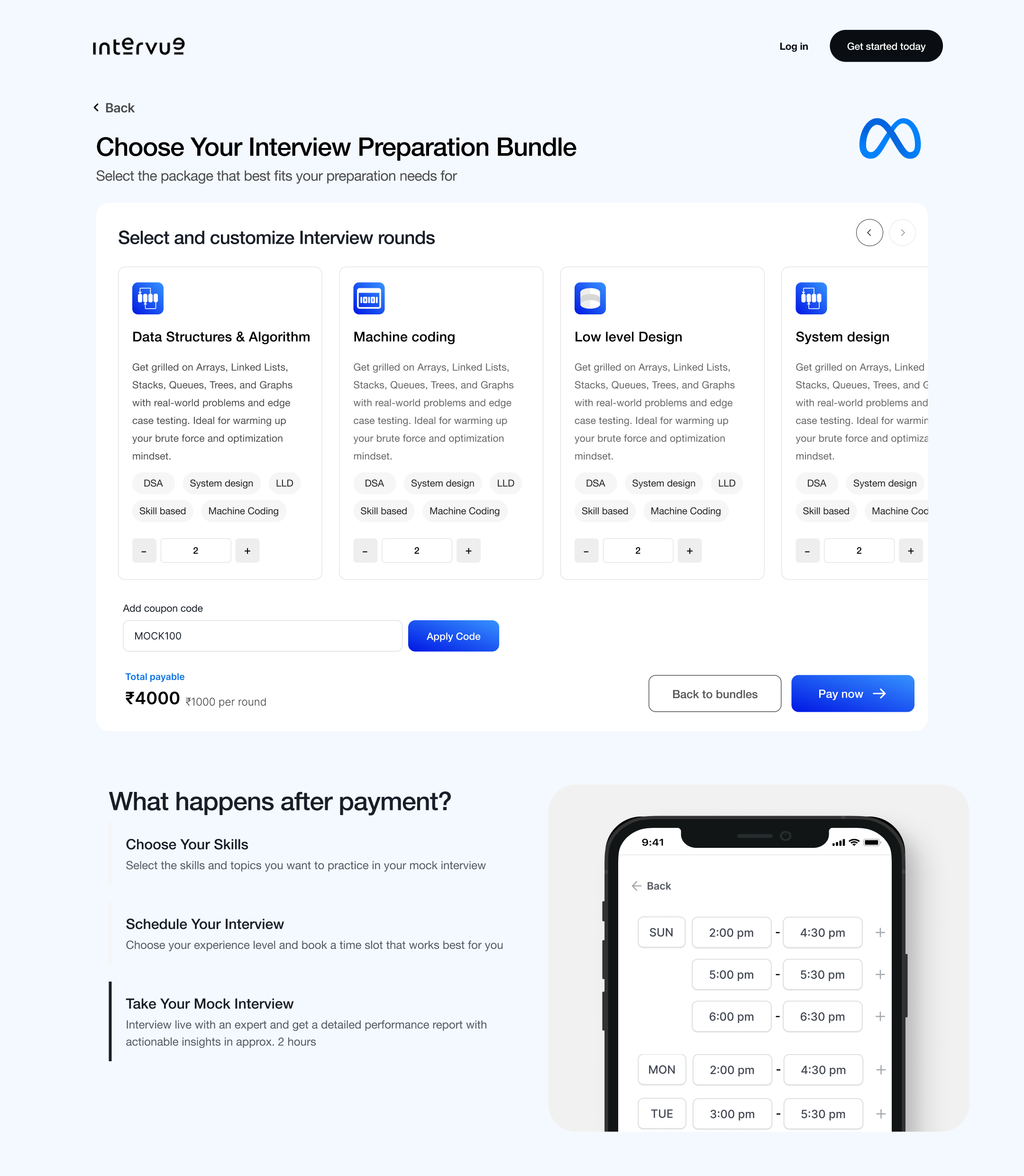



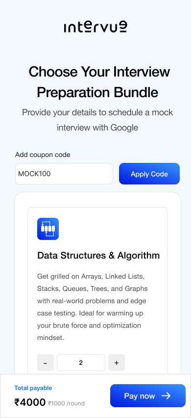
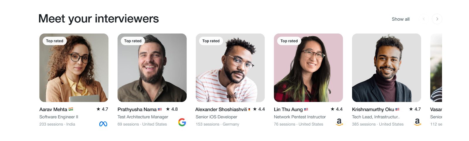
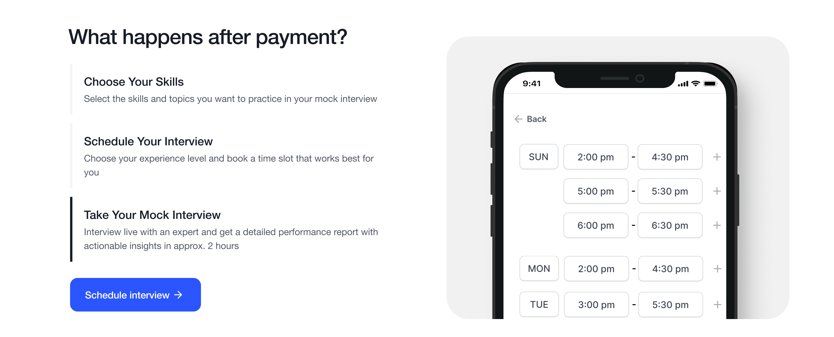
Two new sections on the home page answer the questions that held people back: who is actually interviewing them, and what happens once they book.
Real profiles with photo, role, company, rating and session count, so visitors can see the person behind the interview.
Three clear steps, from choosing skills to scheduling and taking the interview, with a live preview of slot booking.
Measured over the two months after launch. Traffic stayed nearly flat (36k to 40k), which isolates the result to the redesign itself: similar visitors, and revenue doubled.